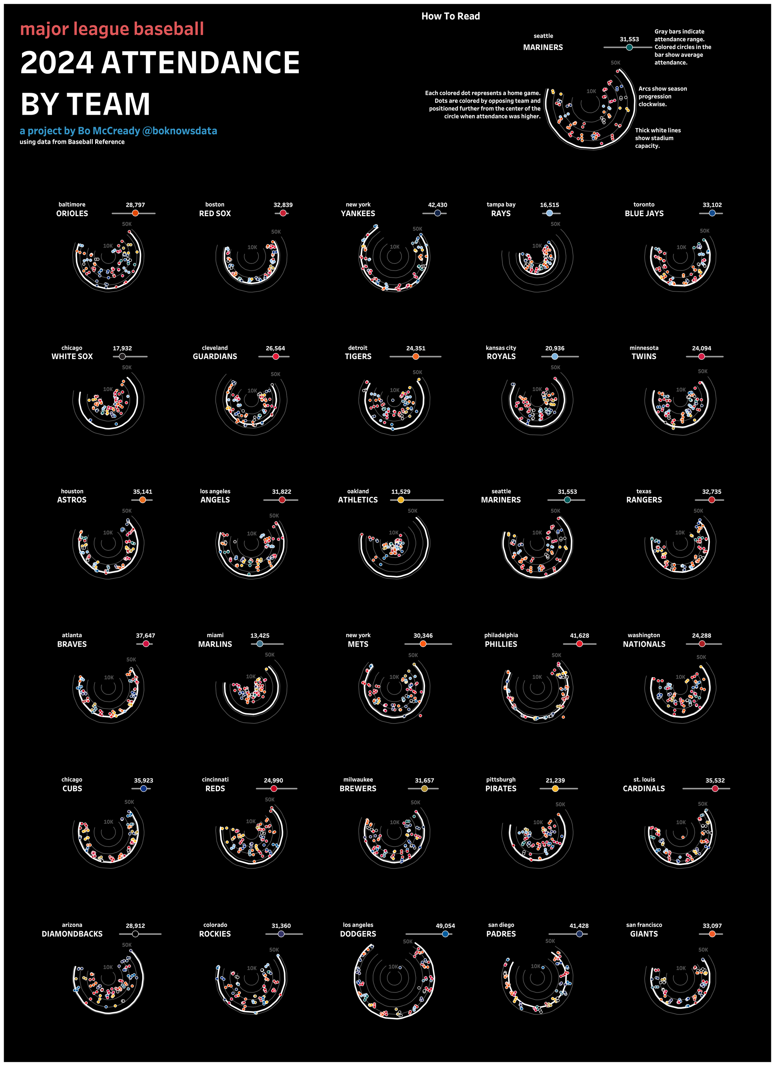
Major League Baseball Attendance Radials: BUILD BREAKDOWN!
If you check out my Tableau Public profile, it’s no secret that I love graphing things in circular shapes. I also love small multiples. And, an interest in baseball statistics is the reason I’m doing this all for a living today! So it’s only natural that one of my all-time favorite vizzes was a series of radial charts looking at MLB team attendance during the 2019 season.
Looking back, I think this project holds up pretty well! But there are a few things I don’t love. First of all, the orange and blue fans indicating teams’ running records, although they felt novel at the time, feel distracting to me today. Second of all, I don’t love the organization of teams – three letter abbreviations, placed in alphabetical order, is a defensible choice, but Major League Baseball fans are used to seeing teams organized by division and I think I should have done that. And finally, although I packed a bunch of data into one sheet, the dashboard itself is still made up of four sheets layered on top of one another with transparency. It’s a trick I’ve used a ton over the years, but in an era of map layers, when I’m six years better as a developer, I’d rather try a build in one sheet.
Jumping ahead to the end, it worked! Here’s what I managed to build. Click here or on the image below to check it out on Tableau Public.

So, how did it all work?
Building the dataset
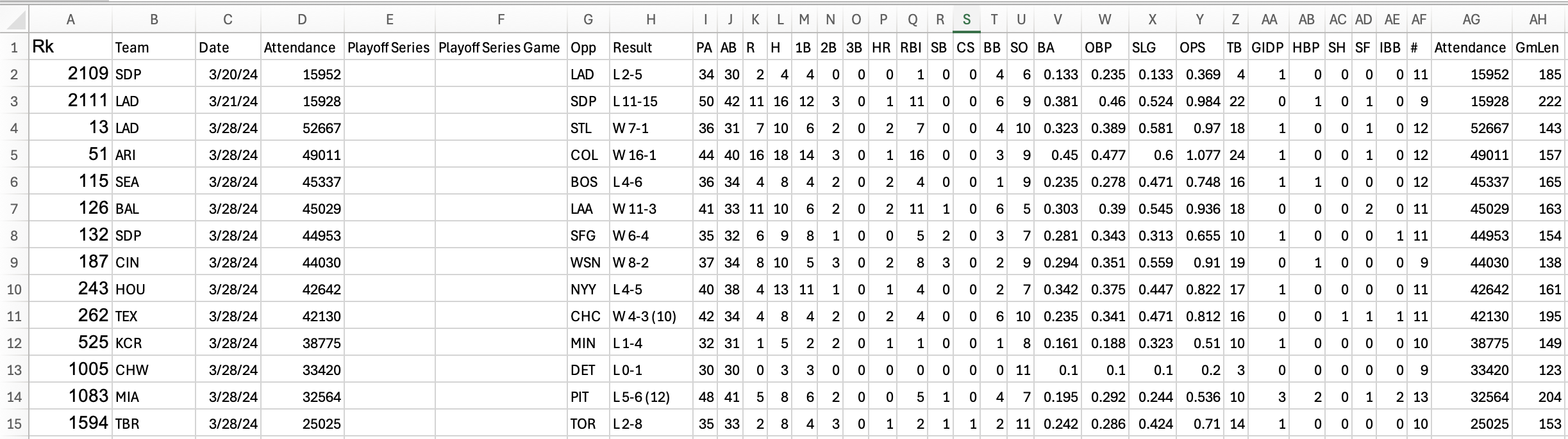
The best source of MLB attendance data is Stathead, a subscription service offered by Sports Reference. For just over $17, I pay for access to the all sports version of Stathead, which means I can query Sports Reference databases on baseball, football, soccer, and more.
Using Stathead, it’s easy to put together a dataset showing attendance data for every MLB game, although there are free ways to do this by exploring team pages from Baseball Reference as well!
The dataset looks like this.
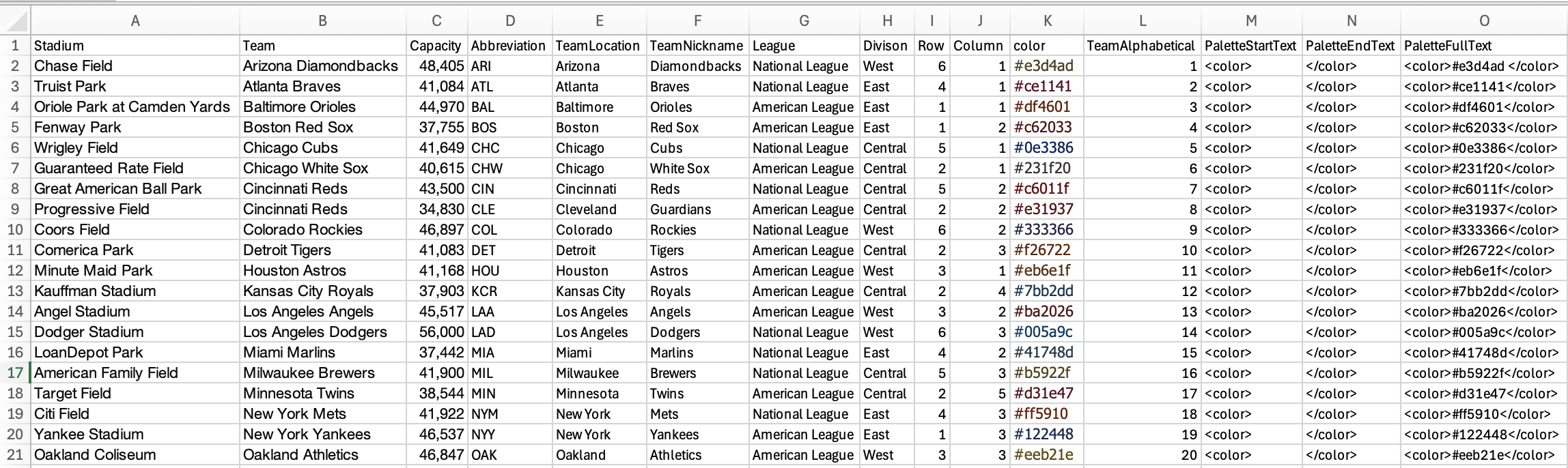
I also needed some complementary data on each team including stadium information and team division. Because there are only 30 teams, I just made this myself.
Finally, I added a tab to allow a cartesian join to copy my data and use multiple layers at once. This is just one column, called Layer, with the numbers 1, 2, 3, 4, and 5 as the values. I’ll show how this was used later!

From there, I’m ready to build my data model in Tableau Desktop. I start with the “Games” tab, and then I join “TeamMeta” on the team abbreviation, and “LayerMeta” as a cartesian join, where I join 1 = 1. This effectively creates a copy of my data for each of the five layers I included in the “LayerMeta” tab.

Making the graphs
The starting point of basically every radial chart I’ve ever made is Ludovic Tavernier’s breakdown of his 2018 Iron Viz final build. It’s brilliant and inspired me to look at Tableau differently, and the calculations used in this blog borrow key components from his.
Everything we’re graphing around a circle starts with three key fields: angle, cos, and sin, which I tend to call @angle, @cos, and @sin as Ludovic did just to keep them grouped together in the working file.
@angle is the most complicated of the three. This is where you’ll determine the span of your curves and where each point sits along them. Because a circle is 360 degrees, we’re basically trying to find places for each point between 0 and 360.
In my case, I’m looking at days within a single year (2024). If I simply wanted a circle that spanned the whole year and to plot the days within it, I could do something like ((DATEPART('dayofyear',[Date])) / 366) * 360 to generate the angle for each day. But, I’d like to be a bit more precise because I don’t want my arcs to span a full 365 degrees, and I want the arcs to start in March (when the MLB regular season started) instead of on January 1st. So, my final angle calculation was this:
(((DATEPART('dayofyear',[Date])-80)//"80" is because in 2024, the MLB season started on the 80th day of the year
/
{ FIXED :max(DATEPART('dayofyear',[Date])-80)}) * 300) //"300" means that I want our radials to span 300 degrees
+30 //"30" means that I want the radial span to start at 30 degrees instead of 0
From there, you can do these simple calculations for @cos and @sin:
@cos: cos(RADIANS([@angle]))
@sin: sin(RADIANS([@angle]))
Plot @cos and @sin and you’ll see that you have your circle!

Now, this is when it starts to get interesting. We’ve made a circular graph with a point for each day and a consistent radius. But that’s not our goal! Instead, we need new coordinates for each day to reflect a variety of different things, starting with attendance.
Also, because our goal is to use map layers, we need coordinates to plot!
So, let’s start by creating new X and Y coordinates for each day, based on attendance.
After some experimentation, my X coordinate calculation looks like this:
(([Attendance]*[@sin])/100000)
+([Column]*2)
The first part adjusts the @sin (X coordinate) value by first multiplying by game attendance and then dividing the result by 100,000. Depending on the dataset you’re using, this 100,000 number could be pretty much anything! In my case, with attendance peaking between 50,000 and 60,000, I’ve chosen 100,000 to make sure that the radius remains pretty small and the sin value is being multiplied by something less than one. This is a good practice when using map layers because our coordinates ultimately will become latitude and longitude, which start looking really funny when the numbers get too big!
The second part, ([Column]*2), is designed to add spacing and help me end up with a grid layout. This just means that teams are shifted two points horizontally for each column I want them to appear in.
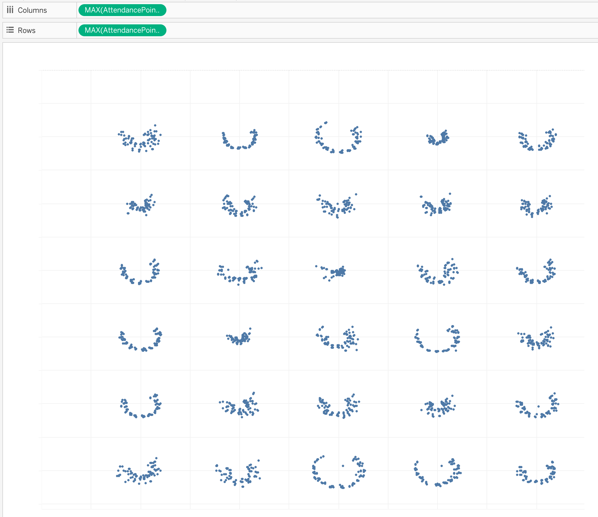
When we replace @sin with our new calculation, which I called “AttendancePointTestX”, we get this – five columns, as expected, with points clearly having varied distance from the origin.

Next, I apply similar logic to a new @cos (Y coordinate) calculation, which I’m calling “AttendancePointTestY.”
(([Attendance]*[@cos])/100000)
+([Row]*-2)
Row is multiplied by -2 instead of 2 because our ultimate points are going to be below the equator, meaning their latitude should be negative.
Replace @cos with AttendancePointTestY, and we have the attendance points we were looking for, in a nice grid!
Now, to take this grid and put it onto a map, we just use a MAKEPOINT calculation.
MAKEPOINT([AttendancePointTestY],[AttendancePointTestX])
Drag your new field into a new view, add date and team onto the detail shelf, and we have the same grid graph, but this time plotted off the West coast of Africa. Map layer success!

It may seem like there’s a lot left to do, but we’ve already done the hardest part, and everything else in this viz is just a variation on what’s already been done!
There are two more things I want to plot in a circular pattern: stadium capacity, and a set of reference lines to make the viz easier to read.
First, let’s do capacity. We’re going to plot this in the exact same way we did our daily attendance points.
CapacityCirclesPartX: (([Capacity])*[@sin])/100000+([Column]*2)
CapacityCirclesPartY: ((([Capacity])*[@cos])/100000)+([Row]*-2)
CapacityMakePoint: MAKEPOINT([CapacityCirclesPartY],[CapacityCirclesPartX])
Drag CapacityMakePoint into your view as an additional map layer, change the mark type to a line, add Team and Date to Detail, add Date to Path, and we get this! Our capacity reference line is mapped as expected (shown here in orange).

Next, I want reference lines at 10k, 20k, 30k, 40k, and 50k to make the viz easier to read. The principles here are exactly the same, but we’re going to leverage the five layers created from our cartesian join. I’m adding [Layer] into these calculations, multiplied by 10,000, to create the expected radii.
AttendanceCirclesPartX: (([Layer]*10000)*[@sin])/100000+([Column]*2)
AttendanceCirclesPartY: ((([Layer]*10000)*[@cos])/100000)+([Row]*-2)
CirclesMakePoint: MAKEPOINT([AttendanceCirclesPartY],[AttendanceCirclesPartX])
Add CirclesMakepoint as another map layer, add Team and Date to Detail, add Date to Path, and then add Layer to Detail as well, and you’ll have five reference lines for each team! In this example, I’ve made them pale gray and dragged them to be the back layer.

Next, I want to label the first and fifth reference lines with “10k” and “50k.”
There are many ways to do this, but what I’m going to do is create a calculated field that references just the two layers I want to label:
Layers1and5: if [Layer]=1 then 1elseif [Layer]=5 then 5 end
Then, I make a label using this formula:
str([Layers1and5]*10)+'K'
Switch the label to “Line Ends” and check only “Label start of line” and you’ll have the expected labels!

Now, at this point, we COULD be done, but there are a couple other things I want to do. First, I want to make a couple of points that I can use to include team locations and nicknames.
I have Row and Column variables in the dataset that form a grid. I just want to adjust those Row and Column points a bit to get them to plot where I want them to. To be honest, this part just required a bit of trial and error, and the adjustments of -0.36, -0.30, and -0.5 are there after trying a bunch of different numbers and seeing what looked good. I ended up with these calculations:
TeamLocationMakePoint: MAKEPOINT(([Row]-0.36)*-2,([Column]*2)-0.5)
TeamNicknameMakePoint: MAKEPOINT(([Row]-0.3)*-2,([Column]*2)-0.5)
Add them as map layers, switch the mark type to text, add the “Team Location” and “Team Nickname” fields to Text, add Team Location and Team Nickname to Detail as well, and you’ll get these labels.

The last thing I wanted to add was average attendance, plotted on a bar showing attendance range.
First, I used Level of Detail calculations to find the Min, Max, Average, and Range of attendance for each team.
TeamMinAttendance: { FIXED [Team]:min([Attendance])}
TeamMaxAttendance: { FIXED [Team]:max([Attendance])}
TeamAverageAttendance: { FIXED [Team]:AVG([Attendance])}
TeamAttendanceRange: [TeamMaxAttendance]-[TeamMinAttendance]
Next, I wanted to use these to plot average attendance. In this case, I’m again using a bit of trial and error to plot these points in a space that I like. I’m dividing average attendance by 60,000 and then using the Column variable to keep things in the grid format for my X coordinate. For my Y coordinate, I don’t need to use attendance at all, I just have to keep the grid format. So, I didn’t bother creating a separate calculation for the Y coordinate, I just brought the logic into the MAKEPOINT.
AttendanceAveragePointX: ([TeamAverageAttendance]/60000)+([Column]*2)-0.1
AttendanceAverageMakePoint: MAKEPOINT(([Row]-0.3)*-2,[AttendanceAveragePointX])
Add AttendanceAverageMakePoint as a new map layer, drag Team onto detail, and you’ll have a point for average attendance. I made it into a red square for now so it’s easy to see what happened.

Finally, we have just one more thing to plot, although it’s a bit tricky! I wanted my average attendance shape to appear on top of a gantt bar showing attendance range. To plot that gantt bar on a map, I need both start and end points, which means I need to use layers again.
First, I calculate the gantt bar start and end points using basically the same logic I used for the average attendance point.
AttendanceRangeStartPartX: ([TeamMinAttendance]/60000)+([Column]*2)-0.1
AttendanceRangeEndPartX: ([TeamMaxAttendance]/60000)+([Column]*2)-0.1
Then, I make our last MAKEPOINT calculation, using Layers 1 and 2 to plot the start and end points of the Gantt bar.
if [Layer]=1 then
MAKEPOINT(([Row]-0.3)*-2,[AttendanceRangeStartPartX])
elseif [Layer]=2 then
MAKEPOINT(([Row]-0.3)*-2,[AttendanceRangeEndPartX])
end
Drag this onto our view as our last map layer, add Team to Detail and Layer to Path (making sure it’s Discrete and not Continuous), and we have our Gantt bar. I’ve made it purple in the screenshot below.

Now, all of the elements of our viz are present, but it doesn’t look that great yet! From here, it’s time to apply formatting. Remove all of the map content from the background (using the Map dropdown and the Background Layers option) and then play around with shapes, colors, and sizes until you like your end product!
Mine looks like this. This is obviously way too squished, but when we expand it within a dashboard, it will look a lot better!
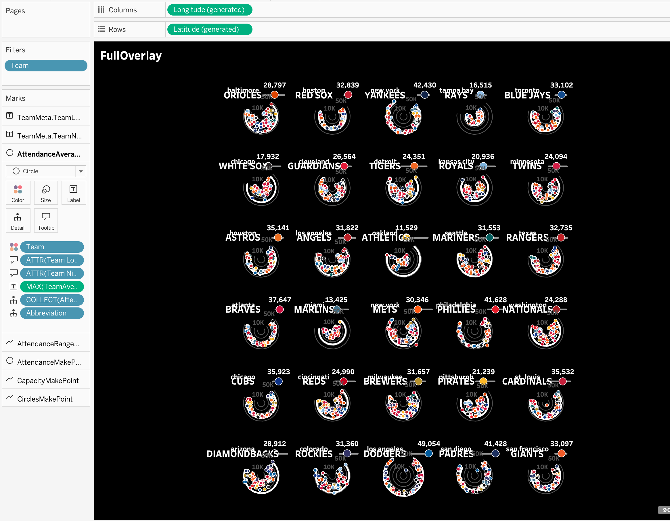
From there, I copied my graph and then selected a single team only to serve as a legend. I added some header text too, and I had a viz!
A build like this has a lot of steps, but there’s also a lot of repetition involved, and with a bit of practice, this kind of thing becomes second nature.
I hope this blog helps demystify radial charts and map layers a bit! This project was a blast to build and I’d love to see others try something similar!