Intentional Color Choices in Data Visualization (An Iron Viz Recap Post)
Color is one of the most obvious features of a data visualization project.
And for a competition like Iron Viz? Well, those are some color choices you want to get “right.”
In this entry, I’ll walk though how I thought about color in my project, the final choices I made, and the ways I think they did (and didn’t!) work as I planned.
Background color
At the start of my Iron Viz build, I was committed to using either a white or a black background. I LOVE experimenting with color and pushing boundaries in my personal work, and my Iron Viz qualifier entry background wasn’t white or black, but Iron Viz is a different animal from other projects and knowing that my work would be projected on giant screens, I thought maximizing contrast needed to be a top priority. And, it’s a simple fact that white and black allow for the maximum possible contrast!
So, I started building… in white.
My first more-or-less complete layout draft looked like this. I used a white background, some sky blue to go with the plane theme, and then two tones of gold to go with my header. I was inspired by the gold plastic pilots’ wings that kids used to get on flights. However, when I showed this shape to people and asked what it reminded them of, their reactions ranged from “golden snitch” to “Whataburger.” The pilot wing headers ended up on the cutting room floor.

Early Layout Draft for Iron Viz 2025
Now, even though that layout and color selection didn’t work, it wasn’t exactly bad. But when I shared a full build (including graphs) with my Sous Vizzer, Clara Wu, she was pretty unimpressed. “It’s flat,” she said, “and it’s not going to look good on the big screen.” As usual, Clara’s advice was excellent, and I went back to the drawing board.
The next iterations took me from pale blue, to darker blue, to, finally, black.

Layout Iteration for Iron Viz 2025
Yes, black is an obvious choice, but it took me a while to get there.
Watching old Iron Viz recordings solidified my choice.
Why? Look at this room.
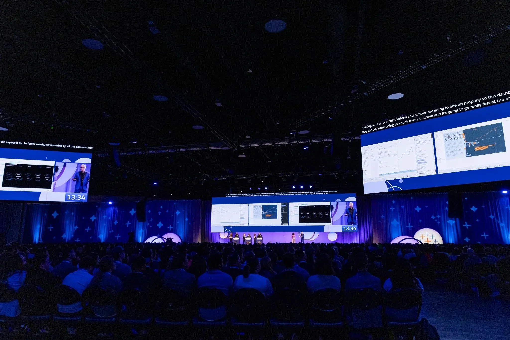
Iron Viz 2025 Competition Photo
From the perspective of the audience, things are dark! A lot of what they see is black! And because I was determined to have my graphs themselves “pop” as much as possible, having a background color that minimized distraction and fit with the vibe of the room felt like the way to go.
choosing other colors
When I committed to a rebuild with a black background, I was determined to keep my sky blue color to bring forward the aviation-related theme. I also figured I’d keep the red color I was using to indicate serious incidents. But choosing other colors was totally up in the air (pun intended).
So, I visited a tried and true resource: Coolors.
If you HAVEN’T used Coolors yet, it’s a fantastic browser-based tool that allows you to generate an aesthetically pleasing five-color palette for free. You can enter and lock as many colors as you choose and then use Coolors to iterate through other colors that look “good” with those until you find something you like.

Example Palette from Coolors
Based on my entered blue and red colors, Coolors suggested a couple of variations of orange - one more salmon/pink, and one brighter - that I thought looked great in combination. They were bold, clean, and didn’t carry with them pre-attentive assumptions of things like “good” and “bad.”
Pursuing accessibility
I’m not an accessibility expert, but I do my best to incorporate design practices that lead to easier perception not just for people with visual impairments, but for everyone.
The first thing I like to do for a project like this is test contrast using the WebAIM Contrast Checker.
This tool allows you to enter the hex codes of foreground and background colors to evaluate whether those color combinations meet Web Content Accessibility Guidelines for adequate contrast.
The screenshot below shows what happens when you test the red color used in my Iron Viz build against a black background. This combination passes! Once I confirmed that the other colors I planned to use passed as well, I knew I’d have a good, high contrast design.

WebAIM Contrast Checker Example
It may seem like contrast is obvious, particularly if you don’t have any visual impairments, but I’m sometimes surprised at what passes and fails, and even if other color differences may be generally perceptible while still failing these WCAG contrast standards, unless there’s a strong artistic reason that you can’t do so, I think designing in a way that meets these standards is a best practice.
We also talk a lot about colorblindness in the data visualization community, but that conversation often doesn’t move beyond “don’t use shades of red and green as the only way to tell two things apart.”
I do not experience colorblindness, so I cannot accurately speak to the challenges colorblind individuals face, but I can use online tools like the DaltonLens simulator to evaluate my work.
The image below shows the results of running two views from my Iron Viz build (that include all the colors I used) through simulations of three variants of colorblindness.
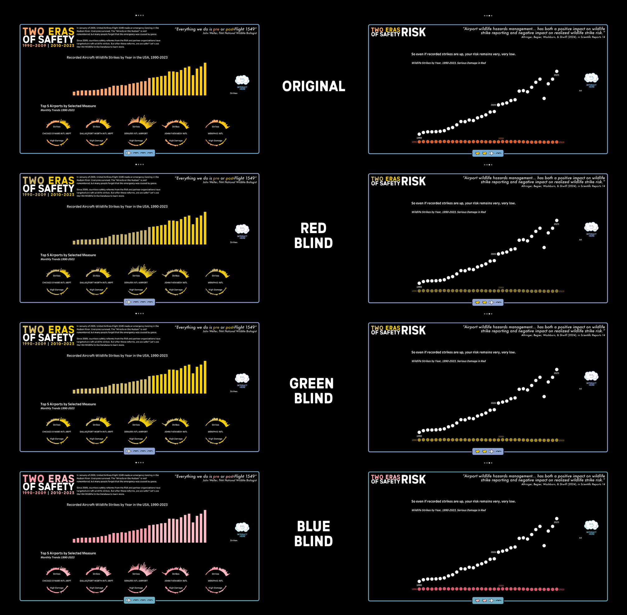
DaltonLens Colorblindness Simulations
What’s good here? Well, following strong contrast standards means that even when perceived by different types of viewers, the graphs themselves never look too muddy against the black backgrounds. There is clear presence, space, and depth to each of these views. There’s no objective score for whether a project “passes” colorblindness standards, but at the very least, I think everything you see above basically works.
On the other hand, particularly in the “Red Blind” and “Blue Blind” simulations, my two orange colors are not easy to tell apart. It’s not impossible and I’d argue there’s still a difference, but it’s definitely not stark.
In fact, even without any simulations attached, my salmon and orange colors become harder to differentiate as images get smaller.
I don’t think this is necessarily a huge problem - after all, there is no place within this project that a viewer is required to differentiate between those salmon and orange colors to acquire information. So, even if someone has trouble telling them apart, their engagement with the project is unlikely to suffer much. In addition, due to their potential similar perception, I made sure that these two colors never touched one another, instead always having some black in between for extra differentiation. But, as I look back on my Iron Viz build, if there’s one things I’d change about the colors, it would be trying something different with those two.
Associating color and meaning
Once I had a set of colors I liked, my next move was to edit the graphs, narrative, and layout to pursue the goal where each color had a consistent meaning throughout the project, and if you saw that color, you could be confident about why it was there.
The changes resulting from this process often were subtle, and the explicit use of a small set of colors with visually consistent meanings may not have been obvious to most of the people looking at my work, but these are the little design choices that make a dashboard easier for a user in ways they don’t necessarily notice - minimizing their mental load by leveraging preattentive attributes and their own working memories to make the dashboard navigation experience just a little bit smoother.
In the end, my project uses only five colors, and when they appear, they always indicate the same thing.
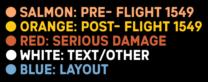
Clean, simple, consistent.
I obsessed over every aspect of my Iron Viz build and color was no exception. If I started from scratch, would I do it all the same? Probably not! But given the constraints of the competition and my goals of maximizing contrast and minimizing mental load, I think it all turned out pretty well.