Using Google Sheets and Tableau For A Small Business Sales Dashboard
In my day job, I live in SQL, Python, and Tableau. That’s why it’s so helpful to have a side project like Pie Chart Press, our screen printing business. We use silk screens to print shirts by hand, with original designs, and it’s grown from a garage hobby into a business with customers all over the world.
Every year, the winter Blue Genie Art Bazaar is our biggest source of sales, stress, and fun. Blue Genie features a curated collection of goods from local creators in Austin, in a shared warehouse space, for six weeks prior to Christmas. We’d been loyal customers for years so when we were first accepted as vendors, we were extra excited!
Tracking sales and inventory remains a significant challenge. Blue Genie is staffed by wonderful and helpful people, but the nature of the market means that we don’t receive sales reports or any item-specific information.
In the past, we’ve just accepted the lack of information and done our best. But this year, we decided to leverage a tool I know well – Tableau – along with Google Sheets to collect our own regular inventory data and better understand what flies off the shelves, what sits, and what we should print next.
Our process was relatively simple, straightforward, and replicable for other small businesses. And the best part is that while using this dashboard, our sales increased a ton!
Here’s what we did!
Creating The Form
Google Forms is a great, free tool for lightweight surveys. It’s not the fanciest or most feature-rich platform, but because an inventory is ultimately just a count of a bunch of different things, it meets our needs!
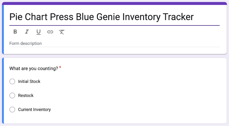
There were three types of information we’d need to record to make the dashboards: our initial stock of shirts that were ready for the first day, our restocks each time we added shirts, and our current inventory. Simply adding the initial stock and restock totals and then subtracting current inventory would let us estimate total sales to date.
Next, we needed a way to record the number of shirts. The best solution we could find in Google Forms wasn’t exactly elegant, but it worked!
With about a dozen designs available, plus multiple color variations, long and cropped lengths, and five sizes, we had a lot of minor variations that we needed to record. So, I wanted a layout that was as compressed and repetitive as possible to minimize the mental load of filling out the form.
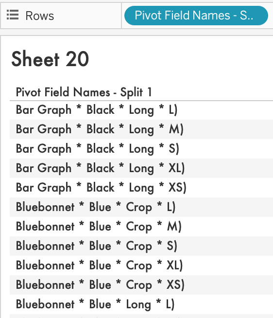
We ended up using the “Multiple Choice Grid” question type, with each shirt variation recorded in the Rows and then numbers from 0-15 in Columns (we assumed that we’d never have more than 15 of each variation on the rack at any time).
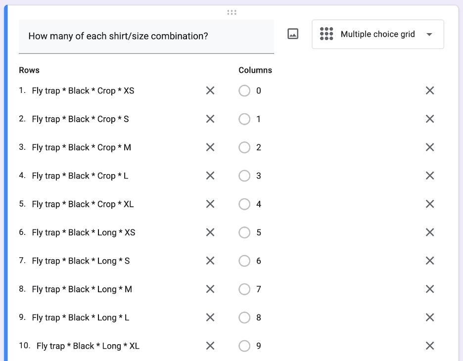
You’ll notice that each row encodes the four types of information we wanted to be able to analyze within the same text box
For example, Fly trap * Black * Crop * M shows the design, shirt color, length, and size. We’ll split this later into four separate variables using Tableau. Any special character will work fine – there’s no particular reason I chose * other than readability!
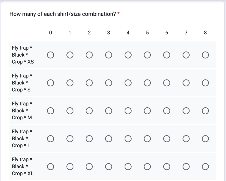
This setup produces a form that looks like this on a computer or mobile device. I’m not sure there’s any way to make entering 100+ variations into a form “fun.” But this method worked fine and took less than 10 minutes each time!
That’s it! Two questions, albeit one of them a monster, to meet all of our needs. Google Forms automatically records a timestamp when a form is submitted, so we don’t need to worry about that.
Nothing’s possible without the form, but that’s not the cool part, is it? Let’s make some dashboards!
Creating the Dashboards
Going into this project, we really had one question to answer:
What do we need to print next?
Wrapped up in that question are two smaller questions:
What are people buying?
What’s currently available for people to buy?
I love pushing the boundaries of Tableau to create innovative chart types and drive toward new and interesting practices. But sometimes, you just need something simple, and with clear questions and a need for immediately actionable insights, my goal was to keep the dashboards basic.
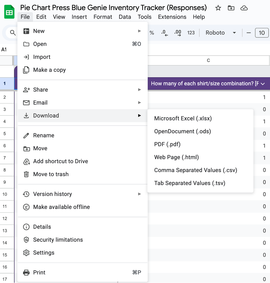
First, I had to import the data from Google Forms. When you create a Google Form, the product automatically creates a Google Sheet to store responses. Although it’s possible to connect Tableau directly to your response sheet, this was a static, offline project, so I chose to just download the data in an Excel format and connect to the Excel file (replacing the datasource with each refresh).
To do this, just choose “File” —> “Download” —> “Microsoft Excel.”
Next, I was ready to connect to the Excel file within Tableau Desktop.
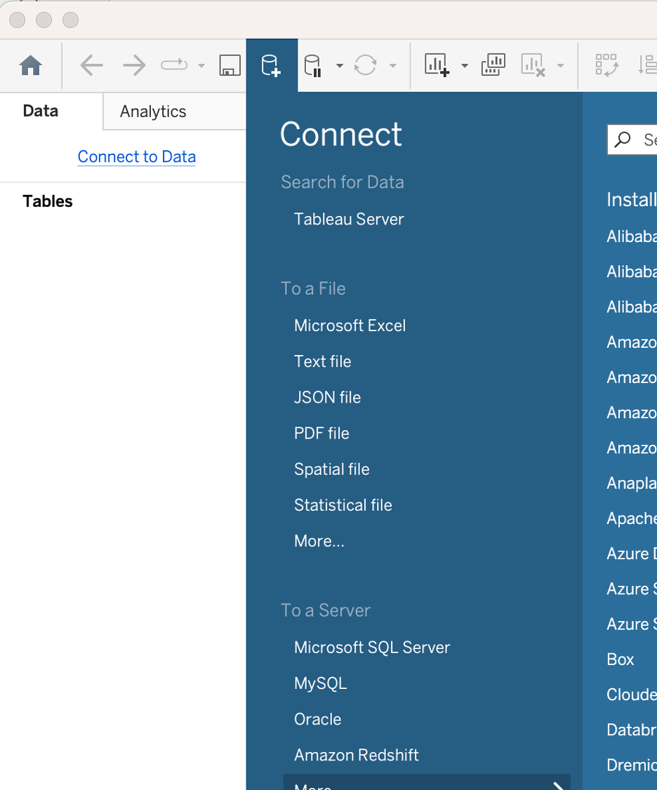
If you’re reading this and you’re new to Tableau, you can click “Connect to Data” under the “Data” header after opening Tableau Desktop and you’ll see a bunch of options for connection types. In this case, I choose Microsoft Excel and then navigate to the downloaded file from Google Sheets.
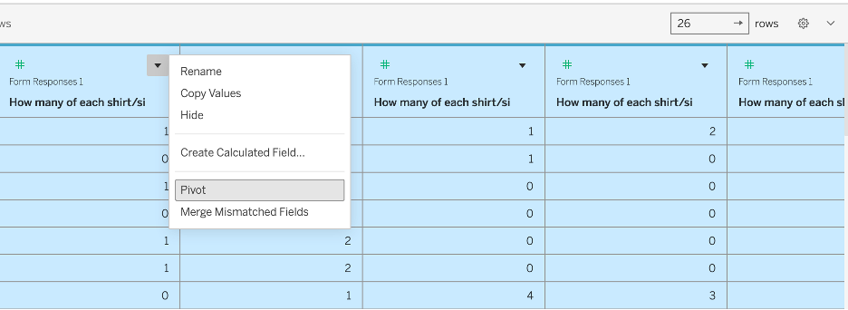
This dataset has one row per entry with one column for each shirt variation – not the most friendly format for analysis! Instead, we want to pivot the data, creating “Pivot Field Names” and “Pivot Field Values” columns and adding rows so that the dataset moves from one row per form entry to one row per form entry AND shirt variation. We do this by selectin all 100+ columns in the data preview window and then clicking the small black arrow on any column and selecting “Pivot.”
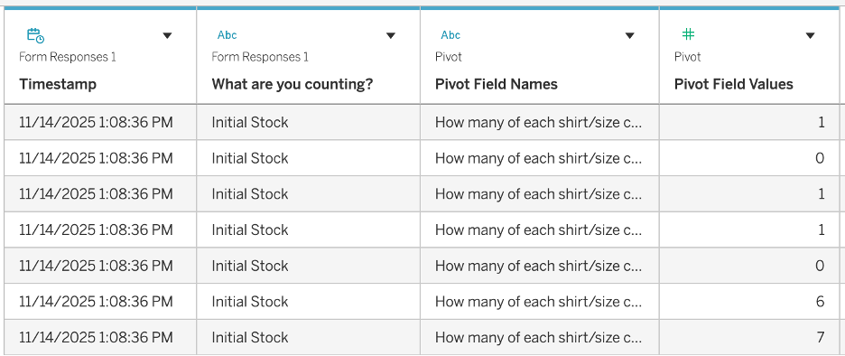
The end result is a simple, four-column dataset that looks like this!
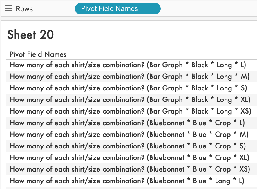
Take a look at the Pivot Field Names column values. You’ll see that they are each a long string with a lot of stuff we want to extract for analysis and a lot of stuff we don’t care about! This is where the SPLIT command helps us.
The first thing I want to do is select everything to the right of the first parenthesis.
To do this, I use:
TRIM( SPLIT( [Pivot Field Names], " (", -1 ) ).
The resulting field looks like this.
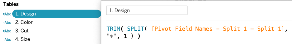
Closer! Now, I just need to get rid of that last parenthesis and then split the remaining text into four separate columns.
First, I take everything to the right of the parenthesis:
TRIM( SPLIT( [Pivot Field Names - Split 1], ")", 1 ) )
The elegantly named result is called “Pivot Field Names – Split 1 – Split 1.” This is awful, of course, but I’m not going to use it again so I didn’t bother renaming it.
Then, I split the result into four separate columns using calculations like this.
From there, I’m more or less ready to start creating the most meaningful calcuations!
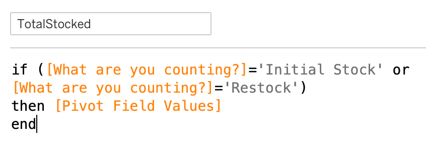
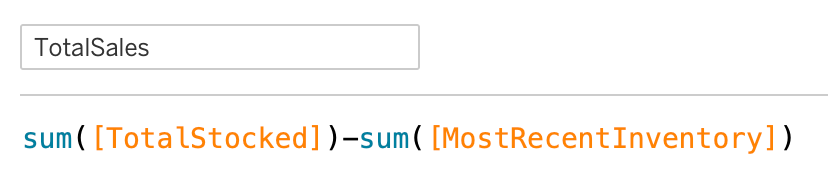
Next, I want to calculate total sales. To do so, I just need to sum the total of shirts we’ve stocked and then subtract our most recent inventory. The end result should be our sales!
First, the “TotalStocked” calculation shows how many shirts we added to our inventory.
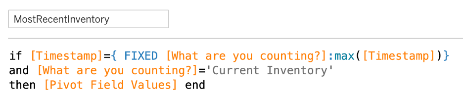
Next, I isolate the most recent inventory count. In our case, I only updated the graphs right after taking inventory, and this calculation makes sure I’m taking only the most recent inventory count (using a FIXED Level of Detail calculation).
Then, TotalSales is as simple as subtracting one from the other!
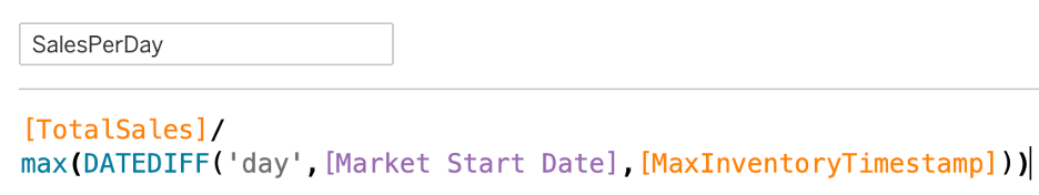
We also added a SalesPerDay calculation for context. In this case, we calculate the date difference between the most recent inventory and the start of the market, which is a parameterized date (in purple below).
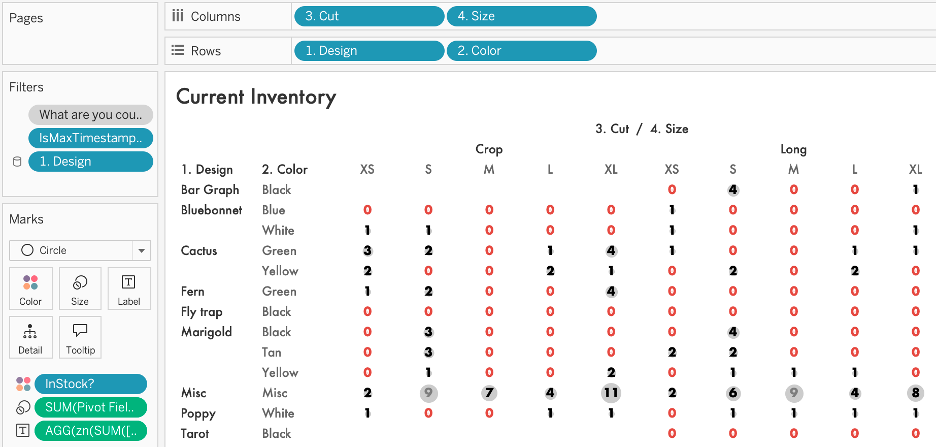
Each subsequent graph is pretty simple! First, to visualize current inventory and see what was out of stock, I made a grid, making sure to add just the “Current Inventory” value for the “What are you counting?” variable as a context filter (which is applied BEFORE Level of Detail calculations) and then also adding an IsMaxTimestamp? Filter, set to True. The visual features small circles sized by the number of shirts in stock and colored based on whether that value was greater than zero (the “InStock?” calculation you see below). This grid works because we built a form that forced us to input “0” when there was nothing in stock, making sure we didn’t have to deal with null values.
Each component of the final sales and inventory dashboard is even simpler! It’s just a series of bar graphs built like this, with a bunch of action filters then applied later. My last step is to rename Pivot Field Values to Count for clarity.
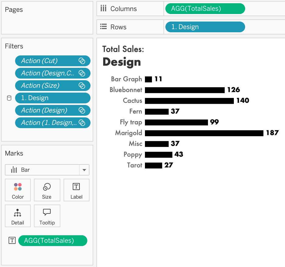
The final dashboard looks like this.
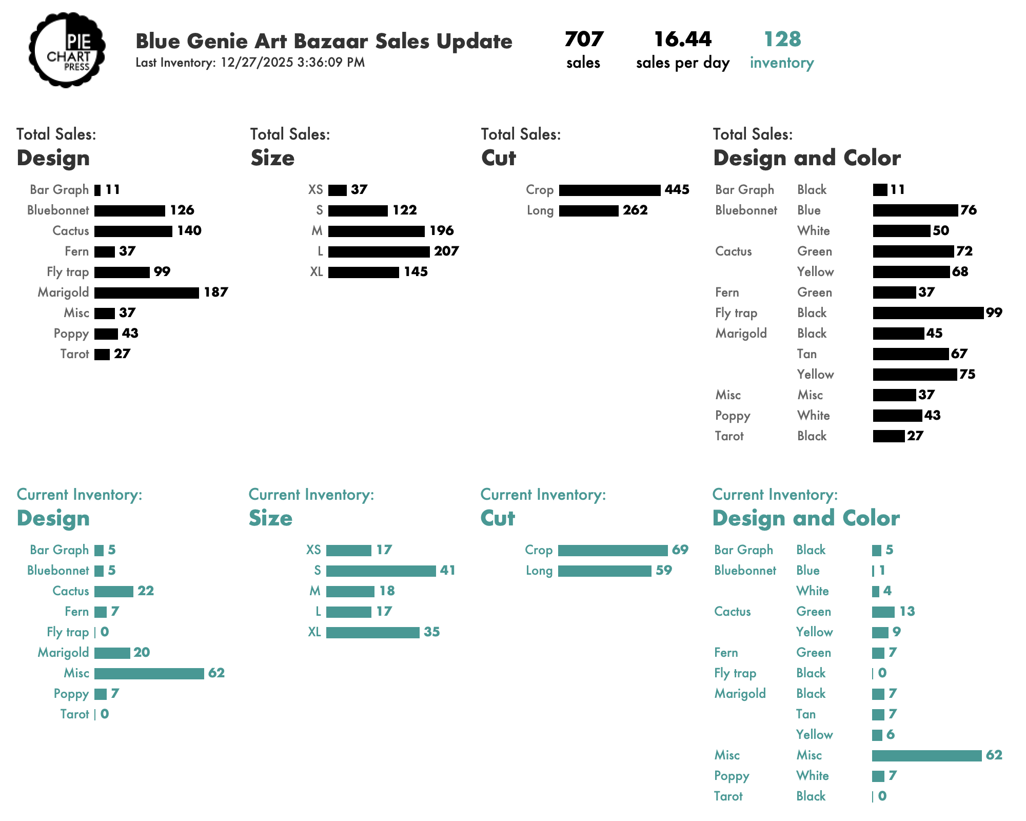
What Did We Learn?
Mediums and larges sold the most, and in similar numbers. Smalls and XLs were a tier lower.
The size distribution of our sales skews smaller than you see across most shirt businesses. We’ve had much more success with female audiences and this size breakout continues to reinforce where our market lies.
(We love folks of all sizes and sell all shirt sizes via Etsy, but our past experience with in-person shops like Blue Genie, as well as our Etsy data, has shown us that anything larger than XL sells very rarely. As a very small business that maintains limited inventory on hand, it makes sense for us to print 2XL+ by request but not as part of our regular print runs).
From a design standpoint, marigolds are the top seller. This isn’t the case online, but in Texas, there are strong associations between marigolds and Dia de Muertos traditions, so I’m not surprised they do so well. I expect we’d have sold even more if we were able to produce more in popular sizes, but these are our most labor-intensive shirts so it’s hard to keep up with demand!
New bluebonnet and fly trap designs were big sellers as well. We’ll keep these in the rotation and try some more color variations in the future!
On the flipside, as much as I love my Black Flag/Bar Graph design, it’s a niche joke with limited appeal. The data tarot shirts did better but still clearly have less demand than my wife’s fantastic floral designs.
What Was The Impact?
We increased our sales by more than 50% from 2024 to 2025.
We sold 448 shirts at Blue Genie in 2024 and 707 in 2025.
Sure, we can’t prove that the dashboards caused that huge improvement. Maybe we had a better location within the market. Maybe the city’s shopping habits changed this year in a way that benefitted us. Maybe the couple of new designs we added really pushed us over the edge.
But y’all know how I feel about a useful dashboard. And the ability to track exactly what people wanted and what they didn’t, and to tailor our printing efforts to match that demand more precisely, likely played a huge role.
Our methods used freely available tools and relatively light work. We could have a fresh dashboard available within seconds of completing inventory. And you can too!
Please reach out if you have any questions about how we did this, especially if you’re an artist or other creative small business and something in here resonated with you!